The Design of Lucky Money in 2021
Written by Deborah Lau-Yu, Editor, Fête Chinoise
Photography by Deborah Lau-Yu & Cola Xia
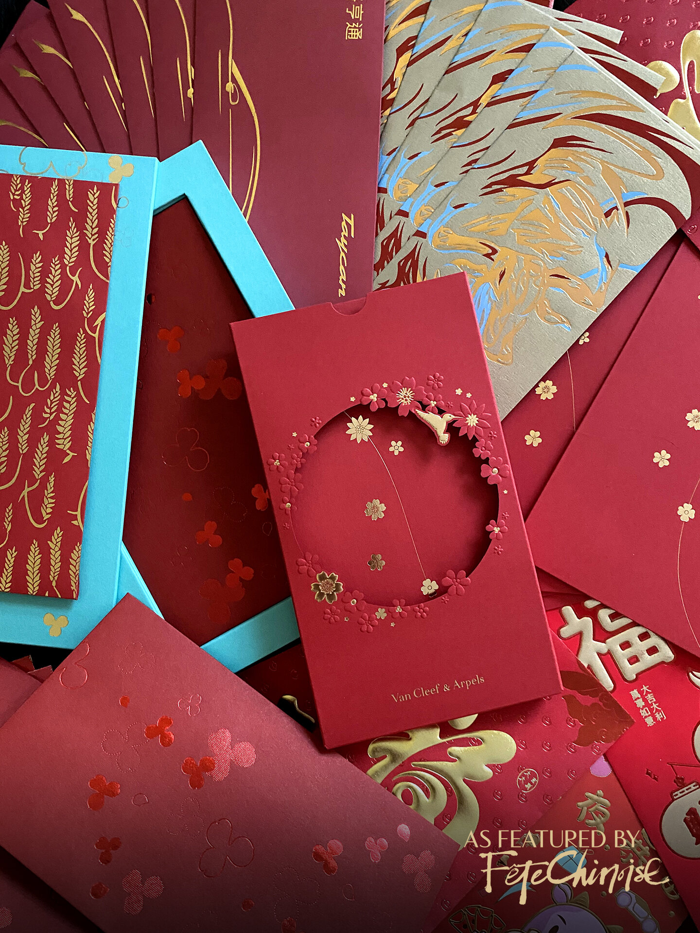
Lunar New Year Ensemble Red pockets, a growing collection, image by Deborah Lau-Yu

SPONSORED BY THE HONG KONG ECONOMIC TRADE OFFICE OF TORONTO
During a vacation after university, I remember walking the streets of Hong Kong, passing by some tourist marketplaces where stacks and stacks of red (and other coloured) pockets piled onto each other at one of the stalls. As a budding designer, I was astonished by the variety of sizes, untraditional colours, printing finishes and volume of Chinese surnames that were pre-printed, all strewn in an arrangement that didn’t appear precious. They looked quite different from the ones I grew up receiving. That said, these were very mundane designs that had little design appeal. (At this point, my collection didn’t evolve much, and as I received more and more varieties, I got pickier about the ones I would keep!)
Since then, a lot has evolved. Today, almost every brand —banks, supermarkets, luxury fashion brands, chocolate companies, radio stations, beverage companies, etc — have their own red pockets to gift to customers and to use as a PR moment to mark the festive occasion. The commercial world has made it a part of their regular calendar to mark this moment and brand red pockets! Some of these creations have become very elaborate, extending to hardcover boxed sets with multi-layered die cuts, special pull-out features and shadow boxes. Perhaps globalization has played a part in the increase of red pocket varieties, making convenient the manufacturing and customization of this staple new year envelopment, and allowing brands to get creative with the design. This trend has opened up a huge opportunity for both the brands getting involved, as well as the design teams in charge of creating a captivating design.
“Our belief is that the connection between culture and objects is important in shaping the narrative of cultural meaning, and the relevance of heritage in our everyday lives. Every new red pocket is an opportunity to push the cultural narrative forward...”
Our team at Fête Chinoise has also collaborated with organizations to create some unique and interesting red pockets in the recent years, in an effort to elevate and inspire recipients with something special and memorable, while honouring culture. Our belief is that the connection between culture and objects is important in shaping the narrative of cultural meaning, and the relevance of heritage in our everyday lives. Every new red pocket is an opportunity to push the cultural narrative forward, but what often happens, is that it can quickly become a missed opportunity or even reverse the momentum. There are times when we are pleasantly surprised, when a design that raises the bar is released and inspires the world. Then the cycle starts all over again, 12 months later!
Therefore, every year, we wait with great anticipation to see what brands have done to celebrate Lunar New Year, including product launches and capsule collections, creative campaigns and special offers, and commercials and video content. But the piece that resonates the most remains to be the red pocket design. The gifting, receiving, and collecting of red pockets are deeply rooted in Chinese tradition, and they are symbolic of good luck and fortune, which are significant to the occasion. Like the mooncake to Mid-Autumn Festival, and the floral bouquet to Mother’s Day, the red pocket is truly at the centre of the spotlight when it comes to the new year.
While as a community, people who celebrate Lunar New Year might be delighted to be acknowledged, there are questions of cultural relevance that arise. Where is the line drawn between honouring the culture and cultural appropriation? Most of the time, when red pocket suites are a way of showing client appreciation for their patronage, which is a wonderful gesture, especially with acknowledgement of culture. At the same time that as a gift, these red pockets should technically be branded any way a company desires, they are also a symbol of tradition, which needs to be done with reverence and respect to culture. It’s a huge discussion that we will not finish today, but is an intriguing topic for brand leaders, and cultural producers and commentators. Other layers of perception also factor into the debate. For instance, there are a subset of people who dislike to use designs where the main and only feature is a brand logo. Several years ago, a friend once said in passing when I asked to see her collection, “I can’t use those [referring to a red pocket with no cultural design and only a big logo] because it feels like I’m showing off where I shop, and that feels a little pretentious.” But for others in social circles where all giving and receiving are using luxury branded envelopes, would it feel more as the norm? For those reading this article that whom are married and hand out red pockets, how do you select the pockets you use to gift? How important is it to you that brands incorporate cultural components in the design? We’d love to hear from you.
Let us take a closer look at what some brands created for the Year of the Ox, and enjoy the design and effort put into celebrating such an important occasion!
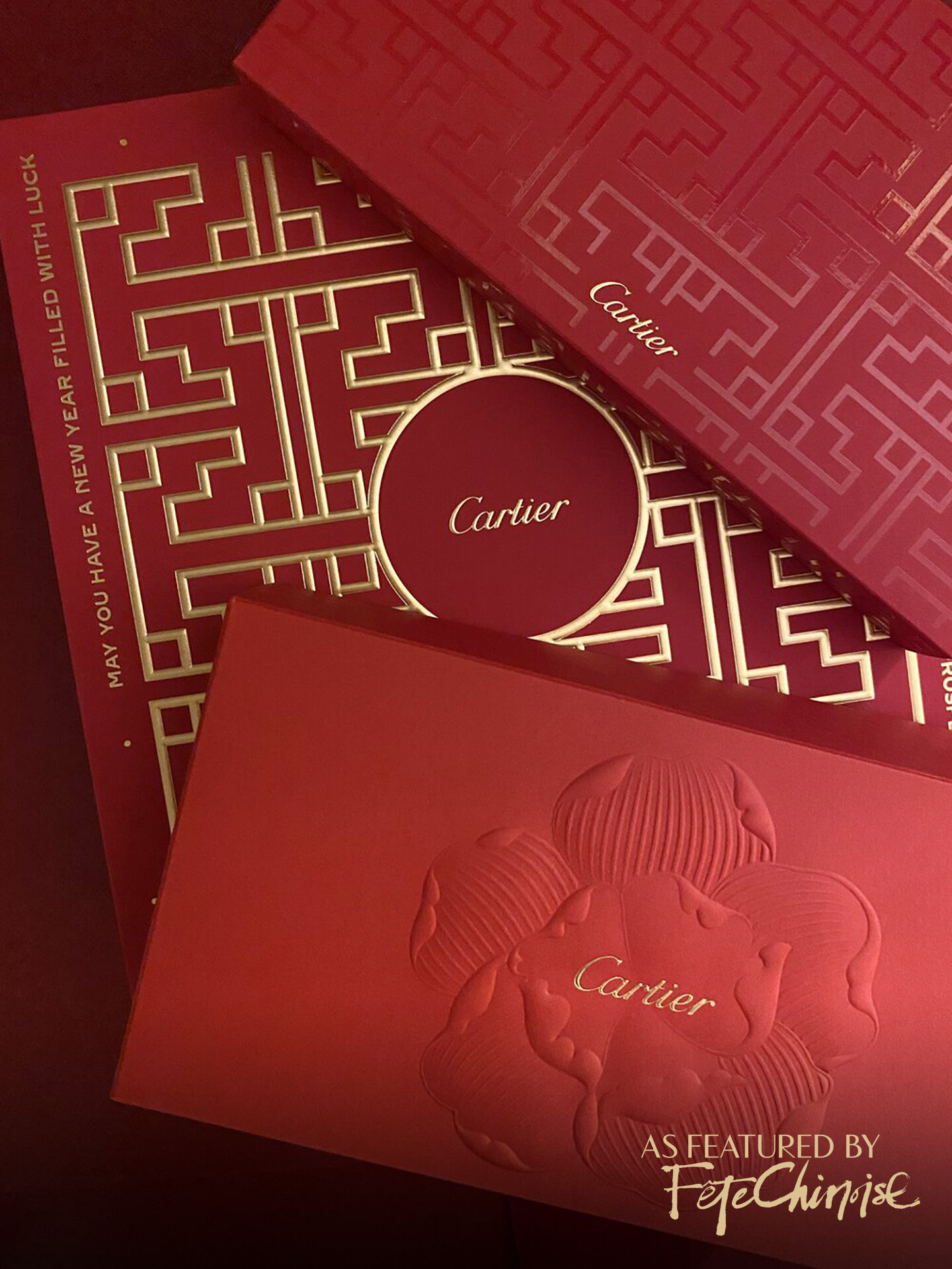
CARTIER’S exterior packaging for red pockets in 2021, along with a previous year’s floral motif. Photo: Deborah Lau-Yu
CARTIER Ppresented an impressive hardcover box of two styles of pockets, with Chinese architectural-inspired details. Photo: Deborah Lau-Yu
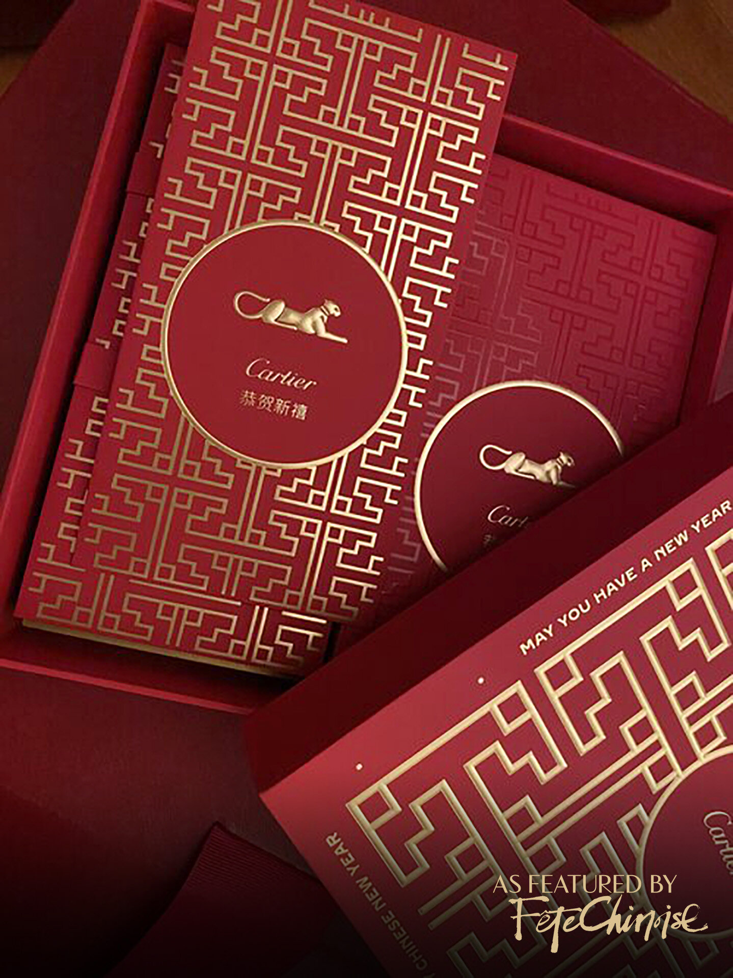
Cartier
Cartier invested in a robust and luxurious hardcover square-shaped box, which featured a gate-like design inspired by Chinese architectural structures, done in a modern and geometric style. It was beautifully embossed in gold, which adds a remarkable texture on the lid. Inside this keepsake box sat two styles of red pockets, one with the pattern in gold and one with the pattern in a glossy tone-on-tone red. The brand’s logo is centered in a red circle outlined with a gold frame that is reminiscent of a circular window in a classical Chinese gate, and accompanied by a new year greeting in Chinese, and the brand icon. The presentation overall is impressive, and the box is definitely something any collector would want to keep, to house red pockets or other little items around the home. The brand itself is quite prominent in the design, but is visually balanced by the pattern which covers the entire pocket.
Shangri-La
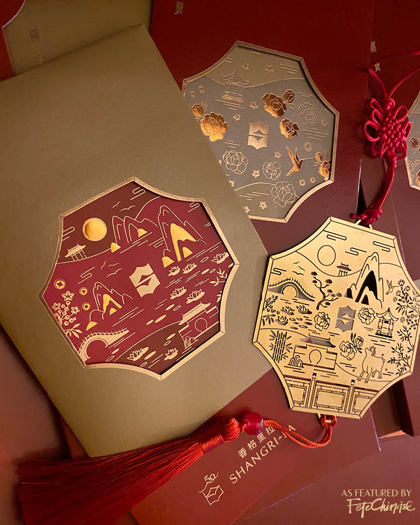
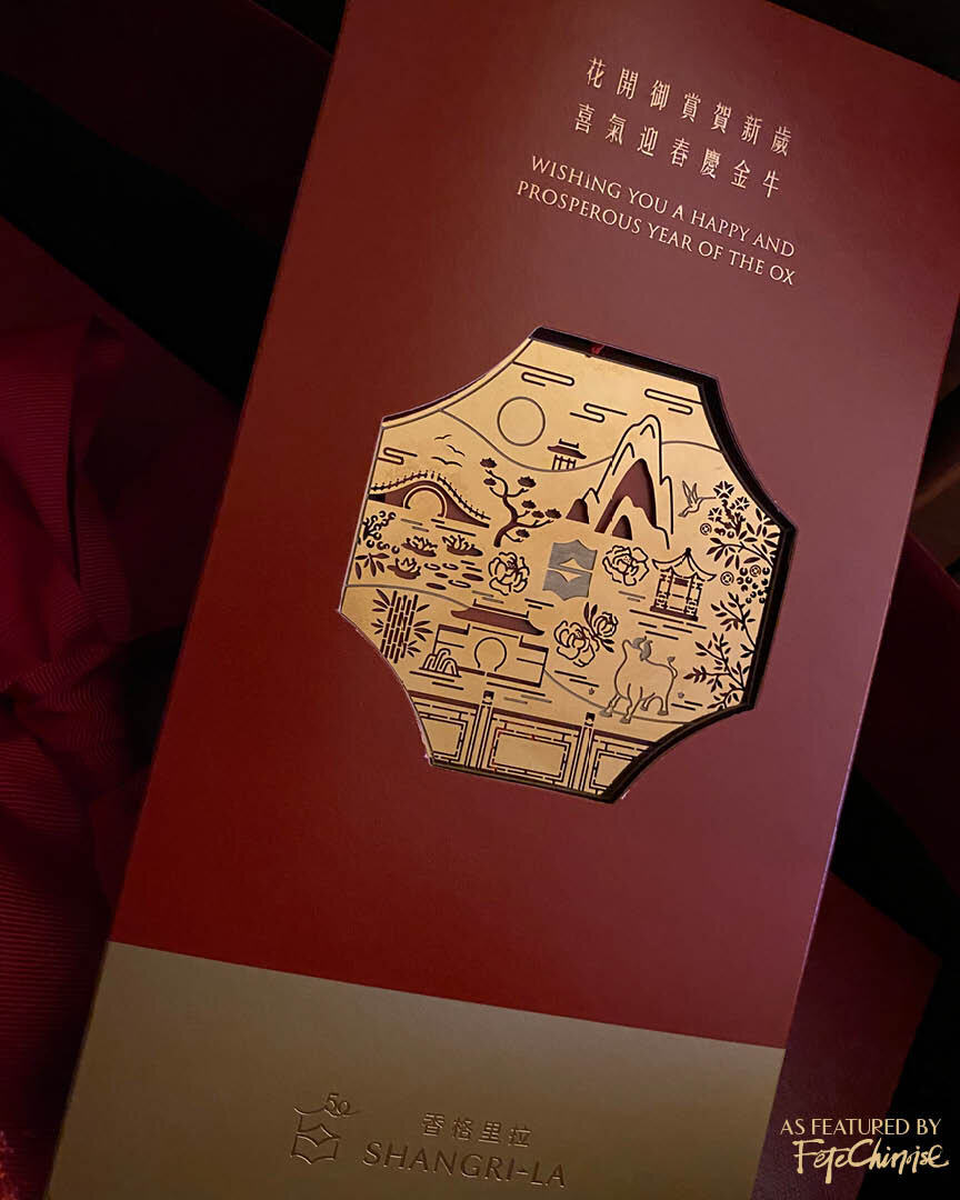
SHANGRI-LA Lunar New Year Red Pocket design, 2021. Photo: Deborah Lau-Yu.
Shangri-La Hotels & Resorts always presents an escape to luxury with their brand and hospitality experiences, and Lunar New Year is one of the occasions where the brand shines with their presentations. Their 2021 red pocket suite arrives in a three-panelled foldout, featuring a laser etched and cut out bookmark in gold on the cover, which pulls out with an auspicious red knot and tassel. Shaped to echo the folder’s window, the golden coloured keepsake calls to mind the brand’s inspiration, The Lost Horizon, written by James Hilton. The book is best remembered as the origin of Shangri-La, a fictional utopian lamasery located high in the mountains of Tibet, which is exactly the fantastical and escape that the red pockets capture. Inside the folder, there are two styles of pockets, one in red and one in gold, with an individual sleeve that slips over each envelope in the opposite tone. A scalloped window on the sleeve frames an artistic thumbnail of florals, mountains, trees, water and Chinese architecture debossed in gold on tonal printing. What a treat for clients and guests, to bring the spirit of Shangri-La into the Lunar New Year season in such a special gift.
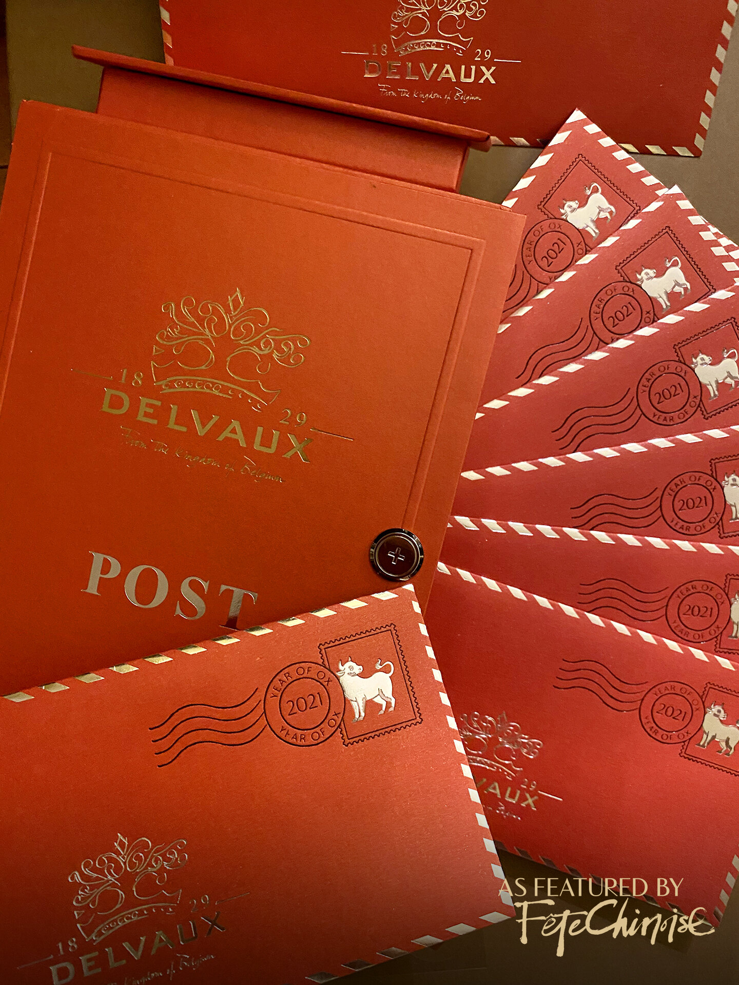
Delvaux Lunar New Year Red Pocket Suite Post Box design, 2021. Photo: Deborah Lau-Yu.
Delvaux
Delvaux designed a postal box-inspired suite, with a magnetic feature where the lock icon appeared. Inside, a set of 8 gifting envelopes were adorned with a debossed faux post mark and golden stamp featuring the Ox. The design is well done strictly from a design perspective, with some thoughtfulness to a unique concept. While the spirit centers around the brand's flourished logo, the postmark of the Ox acknowledges that the set is made for Lunar New Year.
Hublot
Hublot chose to do a simple design with the brand logo's "H" radiating with beams of light framed within a square. The two colours of pockets, red and gold, echo the rotating rays of light when you fan them out. The design doesn’t seem to connect with any cultural elements or stories, and is kept rather straight-forward.
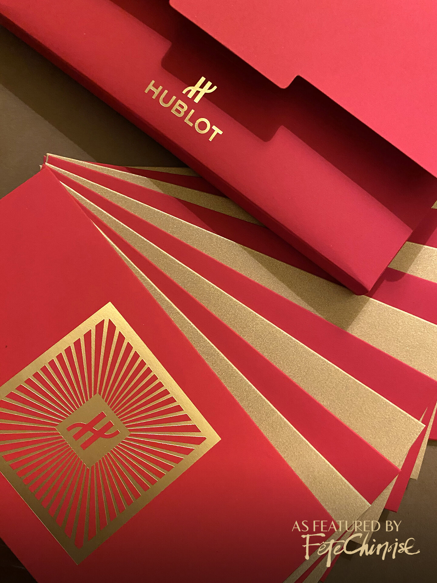
Hublot Lunar New Year Red Pocket 2021. Courtesy of Lisa Fang. Photo: Deborah Lau-Yu
Burberry
In a bold statement, Burberry chose to take a brand-focussed approach, whereby the box and red pockets it contained were all labelled with the most recent sans-serif word mark. Accompanied by some cute stickers, the brand made the package all about it itself and without any cultural components on the actual red pocket. Strictly speaking from a design perspective, the use of type is bold and proportioned for attention, which on any other type of envelopment or box would stand out.

Burberry’s LUNAR NEW YEAR red pocket. PHOTO: Deborah Lau-Yu.

Burberry’s LUNAR NEW YEAR red pocket. PHOTO: Deborah Lau-Yu.
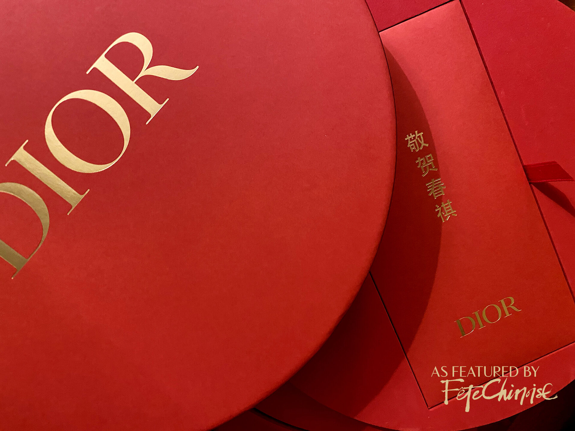
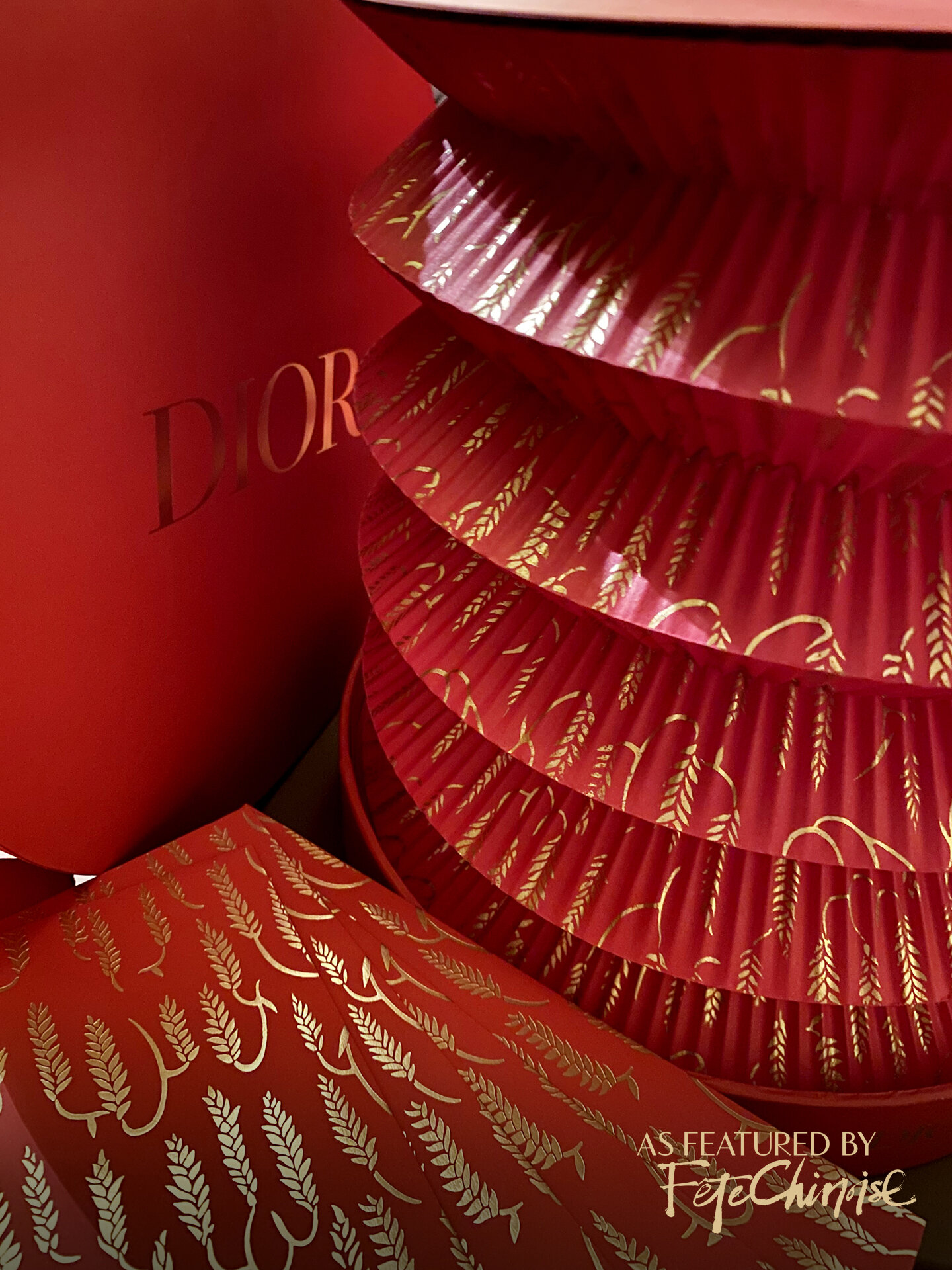
Dior
Dior’s design was elaborate in its presentation, in a large round box, resembling a box for a circular plate. The lid opens to the first layer containing a package of red pockets. On the packaging is a Chinese phrase that means, “celebrating the new spring season.” A continuous pattern of gold leaves from their Lunar New Year Capsule collection is printed across the red pockets — a graphic taken directly from the lush floral patterns on their handbags and garments. The very last layer pulls out to reveal a paper lantern adorned with the same pattern, and the lantern is powered by rechargeable battery using the USB cable tucked into the top deck. The entire package is impressive, and honours the occasion with the nostalgic and traditional accordion paper lantern structure.
DIOR’s LUNAR NEW YEAR PACKAGE DESIGN, SHOWING THE BOX LID AND FIRST LAYER CONTAINING RED POCKETS. PHOTO: Deborah Lau-Yu.
DIOR’s LUNAR NEW YEAR PACKAGE DESIGN, SHOWING THE BOX LID AND FIRST LAYER CONTAINING RED POCKETS. Courtesy of Lisa Fang. PHOTO: Deborah Lau-Yu.
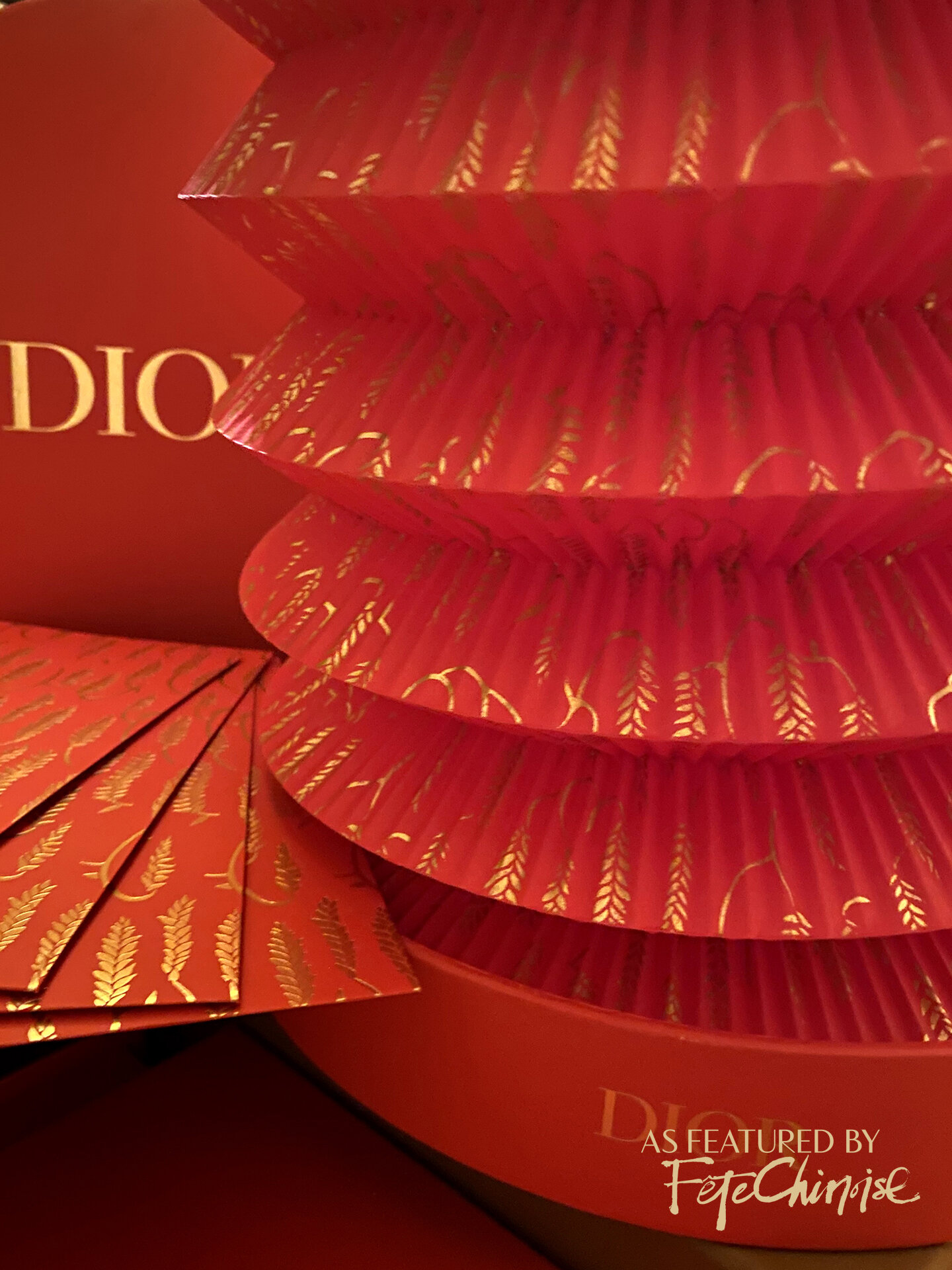
DIOR’s 2021 LUNAR NEW YEAR GIFTING SET WITH RED POcKETS AND LANTERN. photo: Deborah lau-Yu. Courtesy of Lisa fang.
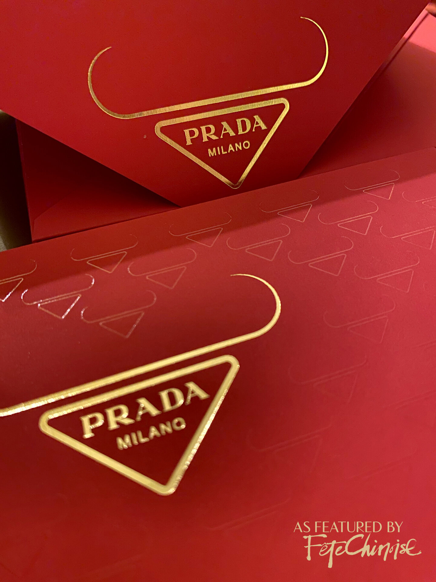
Prada

PRADA LUNAR NEW YEAR POCKETS WERE PRESENTED IN A BOX WITH A SLEEVE ADORNED WITH TONE ON TONE OX SILHOUETTES, CREATED WITH REFERENCE TO THE BRAND LOGO. Courtesy of Lisa Fang. Photo: Deborah Lau-Yu
Prada took an interesting approach this year, by doing something that is rarely seen when it comes to brand guidelines: they used their own logo adapted into a motif that looks like the abstract silhouette of an Ox. At first, it might look like a handle of a handbag resting on top of the iconic upside-down triangular logo, but once your eyes tune into the raised glossy tonal pattern on the box sleeve, it becomes obvious that the shape is based on an Ox.
The pockets are plainly red with the prada logo-ox on the flap, and sit in a plain gold coloured box with no further printed detail. Overall, the spirit of design is very much about the brand, anchored by the logo shape.
PRADA LUNAR NEW YEAR COLLECTION 2021
Gucci
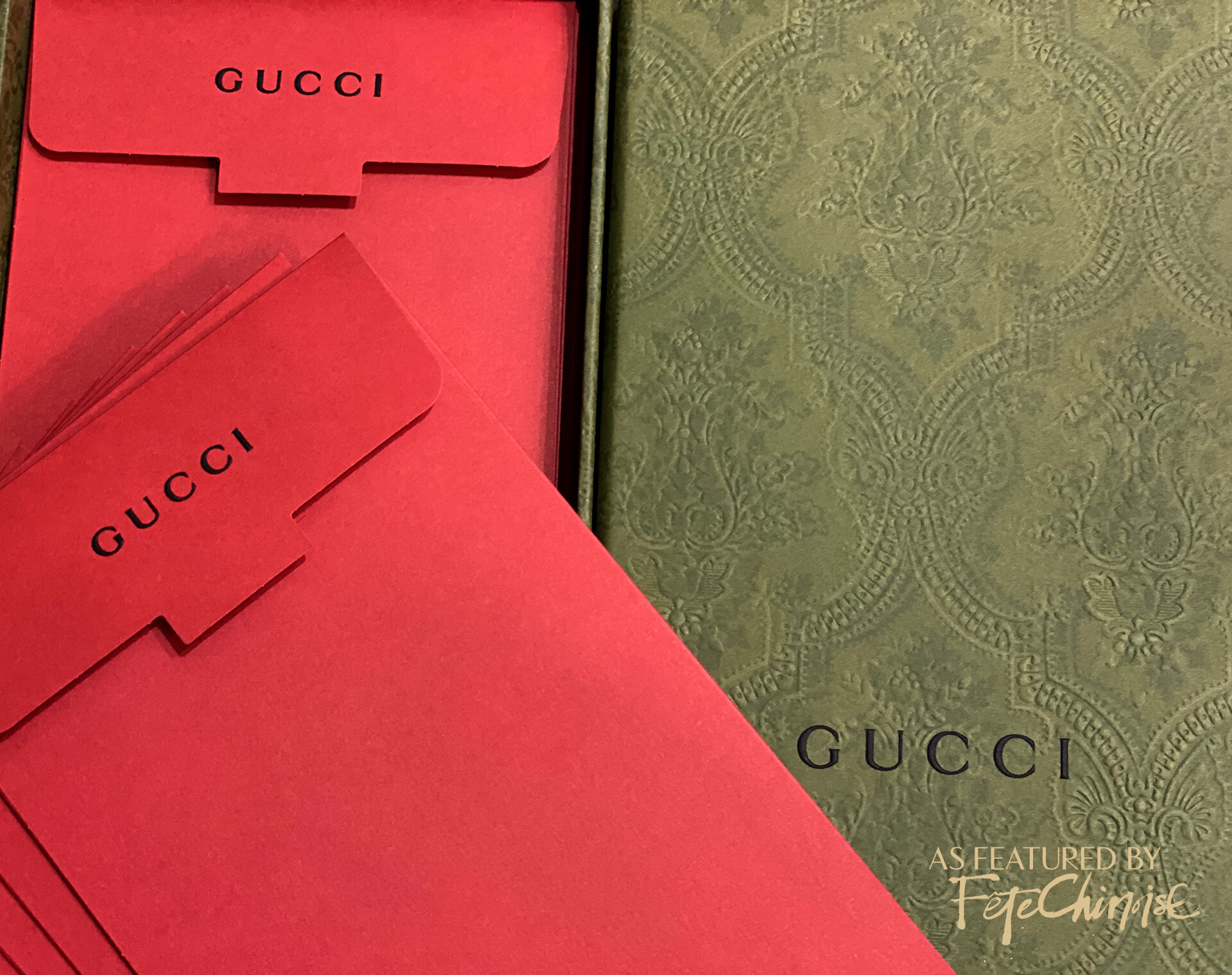
GUCCI LUNAR NEW YEAR COLLECTION 2021. PHOTO: COLA XIA.
Gucci’s suite arrived in an exquisite box, done in an earthy green tone with a debossed wallpaper-like pattern, consistent with the visual tone of their campaign photos. Inside, the cotton paper envelopments were simply red, with the Gucci logo on the flap. We would have loved to see a nod to their LNY campaign with Doraemon here, or a touch of design elements on the pockets.
Valentino
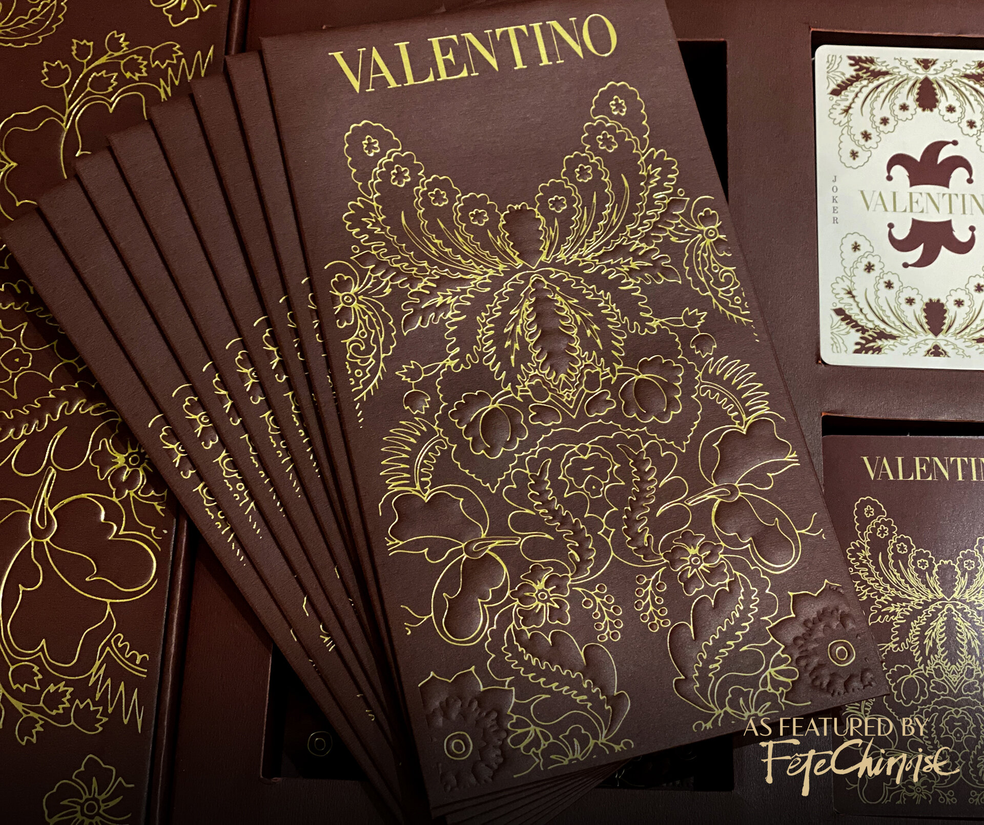
VALENTINO LUNAR NEW YEAR COLLECTION 2021. PHOTO: COLA XIA.
Valentino presented an intricately patterned suite with playing cards. The design is quite detailed, with a delicate gold outline that combines many abstract florals and leaves on a merlot toned pocket. From a culturally-tuned eye, the design’s aesthetic does not relate to Chinese culture and the traditional visual presentation of flowers, especially species associated with Lunar New Year. However, the design effort and overall package is impressive on its own, with multiple components that make it feel complete upon arrival.
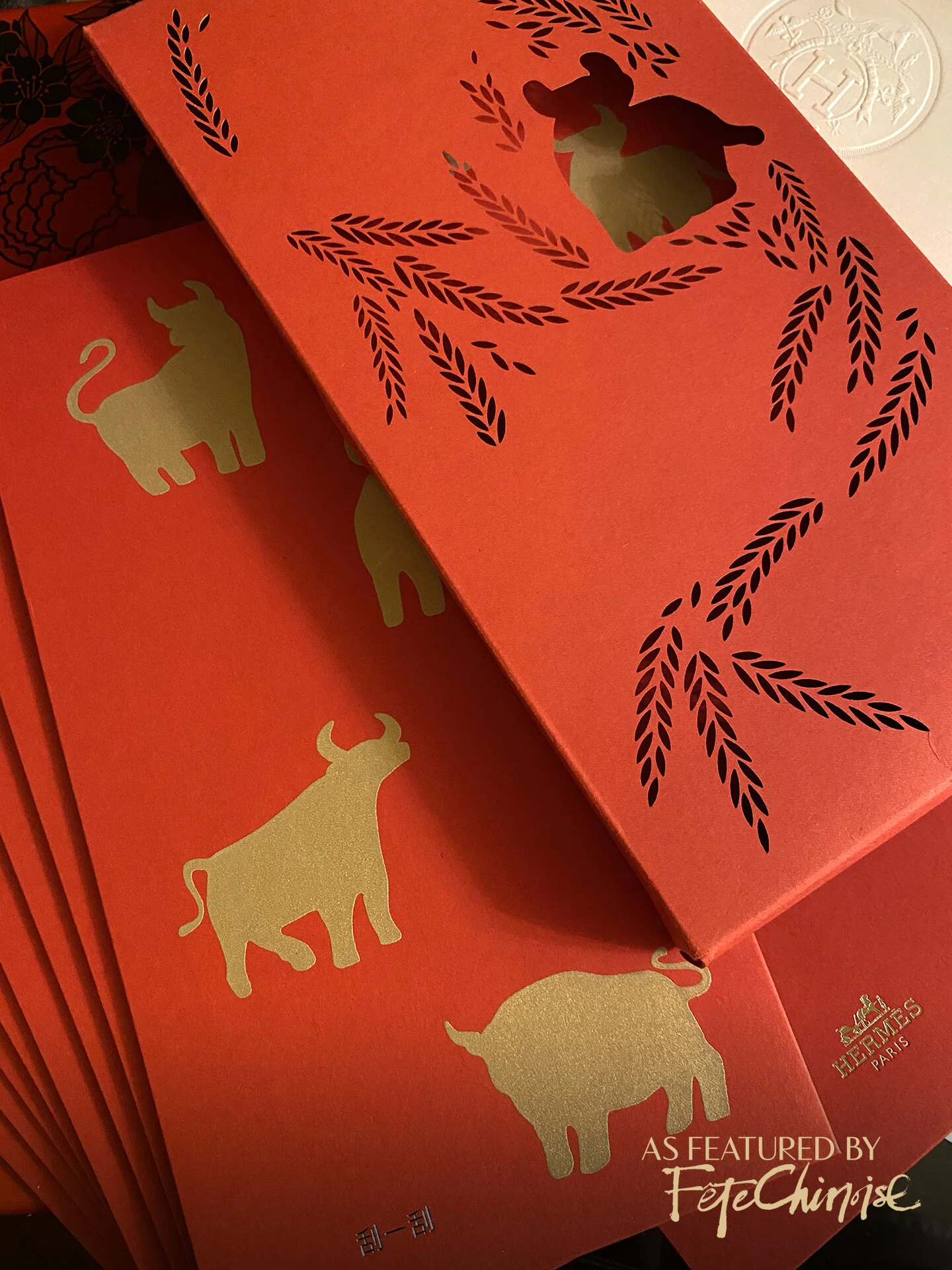
Hermès
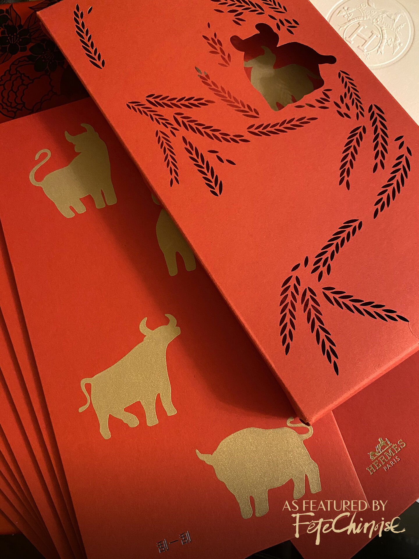
Hermès LUNAR NEW YEAR COLLECTION 2021. PHOTO: Deborah Lau-Yu
Hermès had a very sophisticated package, all in the subtleties. Presented in a laser cut envelope, an Ox silhouette from the pockets inside peeks through, with delicately cut leaves that dance across the front face. Inside, the pockets are made of a smooth paper stock, with soft touch gold printing (featuring four ox silhouettes) that feels a bit like raised printing and engraving at the same time. The secret to this design is that these Oxen can be scratched off to reveal a new year message underneath! A Chinese phrase is debossed in gold foil at the base. True to the sublime spirit of Hermes, the logo of the brand is the most discreet element, done in a tiny half inch marking at the back bottom of the pocket. The design choices prioritizes for the celebration of Lunar New Year, with a spotlight on the Ox.
Louis Vuitton
Louis Vuitton created an outer package design that referenced their trunks, with the hardware embossed in gold. Inside, a set of red pockets featured their maison’s motifs in gold and blind embossing, resembling coins fluttering around the Louis Vuitton logo which is in the centre.
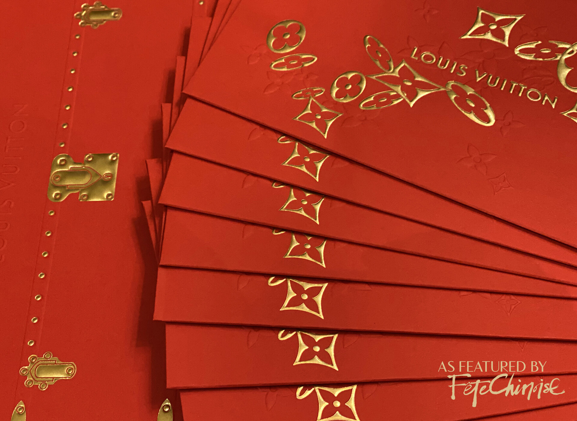
LOUIS VUITTON’S RED POCKETS PRESENTED IN A TRUNK-INSPIRED ENVELOPMENT. PHOTO: COLA XIA
Thom Browne
Thom Browne’s design was relatively simple, with a single line gold border, which frames the red space with a cartoon outline of an ox with their brand’s signature dog. It is a cute moment of the two animals staring at one another, but the illustration does leave more to be desired.

THOM BROWNE LUCKY RED POCKETS. PHOTO: COLA XIA.
Tiffany & Co.
As bold as their most recent jewellery collections and campaigns, Tiffany took a modern-art inspired approach with painterly strokes in gold that artistically wrap around each pocket. The back flap features an illustrated friendly Ox figure with the company logo. Presented in their signature (annual) slipcase and pull-out box, the pockets alternate in traditional red and Tiffany Blue (the latter would be great as a gifting envelope for weddings especially, with a nod to “something blue.” When nestled into the box, the strokes of the design printed on the pocket matches up to visually continue onto the border of the box and all the way around. Structural and co-ordinated details like this elevate any design. The brush strokes are a smart choice, capturing the high energy, modern art look of their brand’s recent jewellery, as well as the energetic and dramatic brushstrokes in Chinese calligraphy and art.
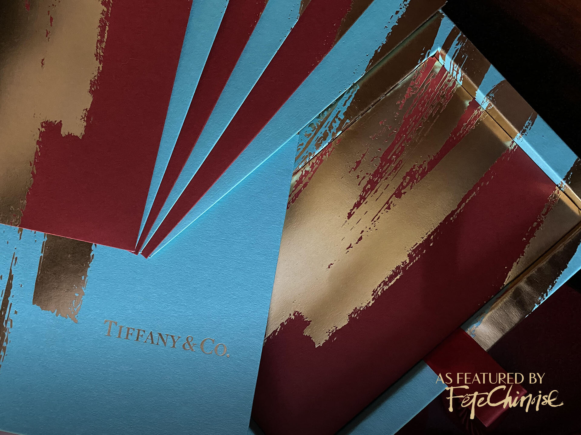
TIFFANY & CO. 2021 LUCKY MONEY POCKETS IN RED AND TIFFANY BLUE, PRESENTED IN A PULL-OUT BOX. PHOTO: DEBORAH LAU-YU.
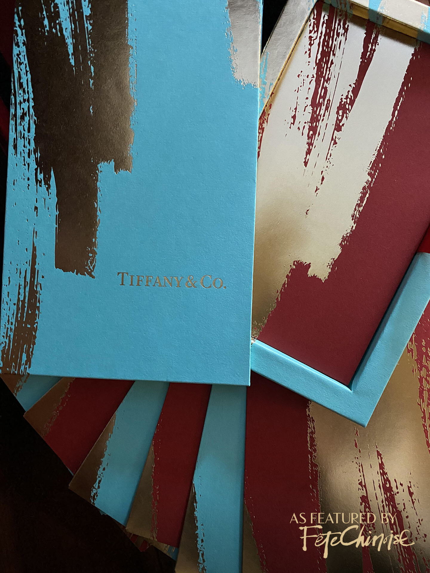
TIFFANY & CO. 2021 YEAR OF THE OX LUCKY MONEY POCKETS. PHOTO: DEBORAH LAU-YU.
Porsche
Porsche spotlighted their coveted electric Taycan on their red pockets, paired with a meaningful Chinese phrase that refers to wish for the roads ahead being smooth and open. Though the design is still brand-focussed, but the message pairing brings the sentiment of Porsche’s design closer to cultural tradition. The illustration is sleek and true to brand, which is surely popular amongst car enthusiasts!
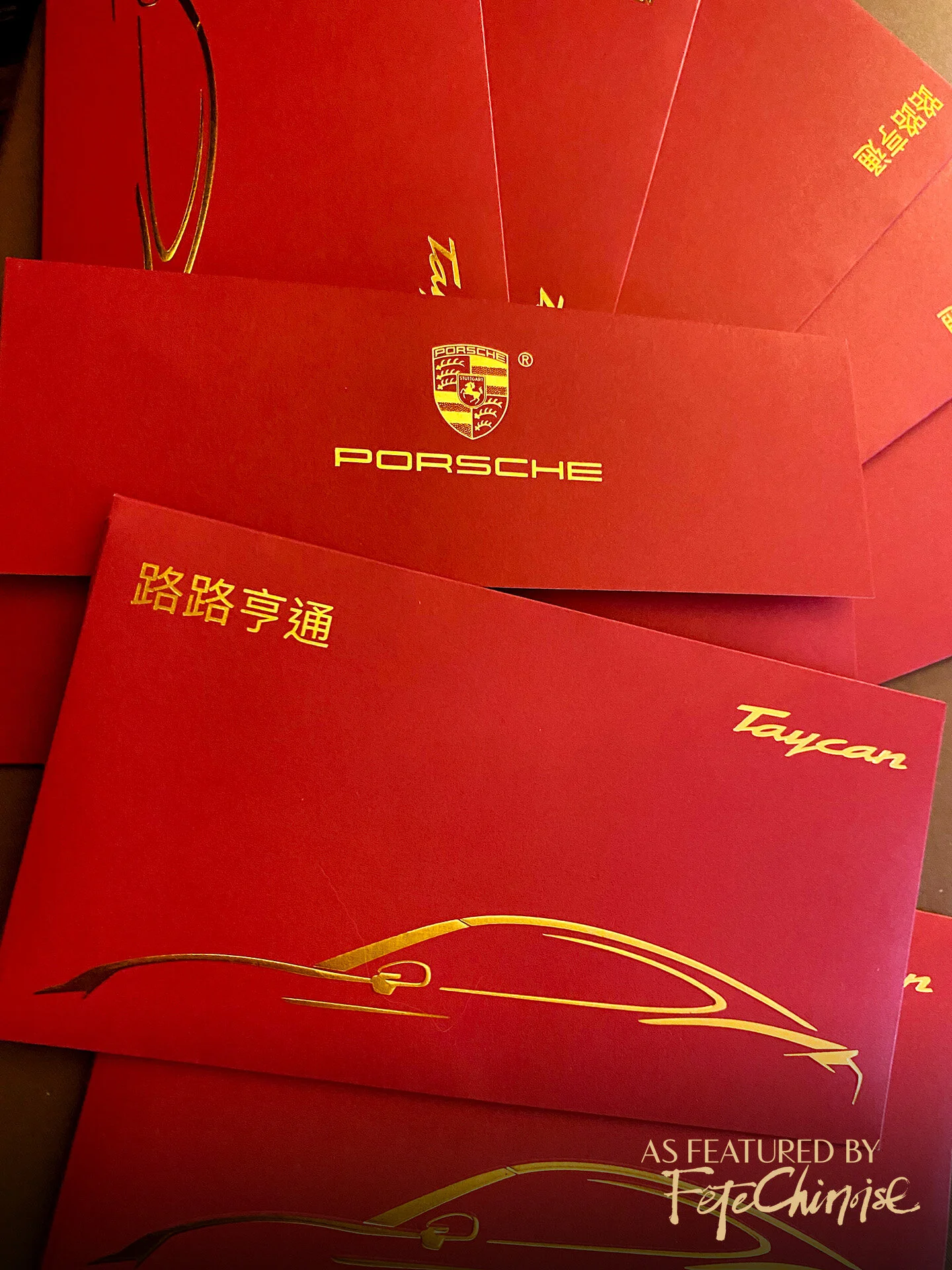
PORSCHE’s 2021 LUNAR NEW YEAR RED POCKETS FEATURING THE TAYCAN. PHOTO: DEBORAH LAU-YU
Van Cleef & Arpels
Van Cleef & Arpels created a stunning set of pockets with a plethora of florals, which look to be inspired by the maison’s jewellery collections. Made of a cottony wove cardstock, the pockets were sophisticated in the balance of gold details to the red space. Presented in a die-cut case that shows off the intricate cut-out silhouettes of the flowers and a hummingbird, the design is exquisite. The brand’s name is pressed in gold at the bottom of the case, and their logo appears on the back flap of the pockets, leaving the design on the front to take centre stage. The clustering of flowers in red and gold naturally yield a festive tone for the new year, even without including more traditional species like the peony.

VAN CLEEF & ARPELS PRESENTED AN EXQUISITE SUITE WITH BIRDS AND FLORALS. PHOTO: DEBORAH LAU-YU
Holt Renfrew
Holt Renfrew presented an Ox in full and vibrant momentum, and departed from traditional red. Collaborating with artist Jeremy Leung, the illustration references a variety of traditional Chinese paintings that featured the river ox, notable for its wide horns and proximity to water. The strokes echo the energy of traditional painting, while taking on crisp edges and colour in a contemporary style. Leung’s work represents a constant state of flowing energy, which was captured in this unique design for the Canadian luxury retailer. We consider this project one of the most unique sets of lucky red pocket designs for 2021, with its distinct use of colour and style!
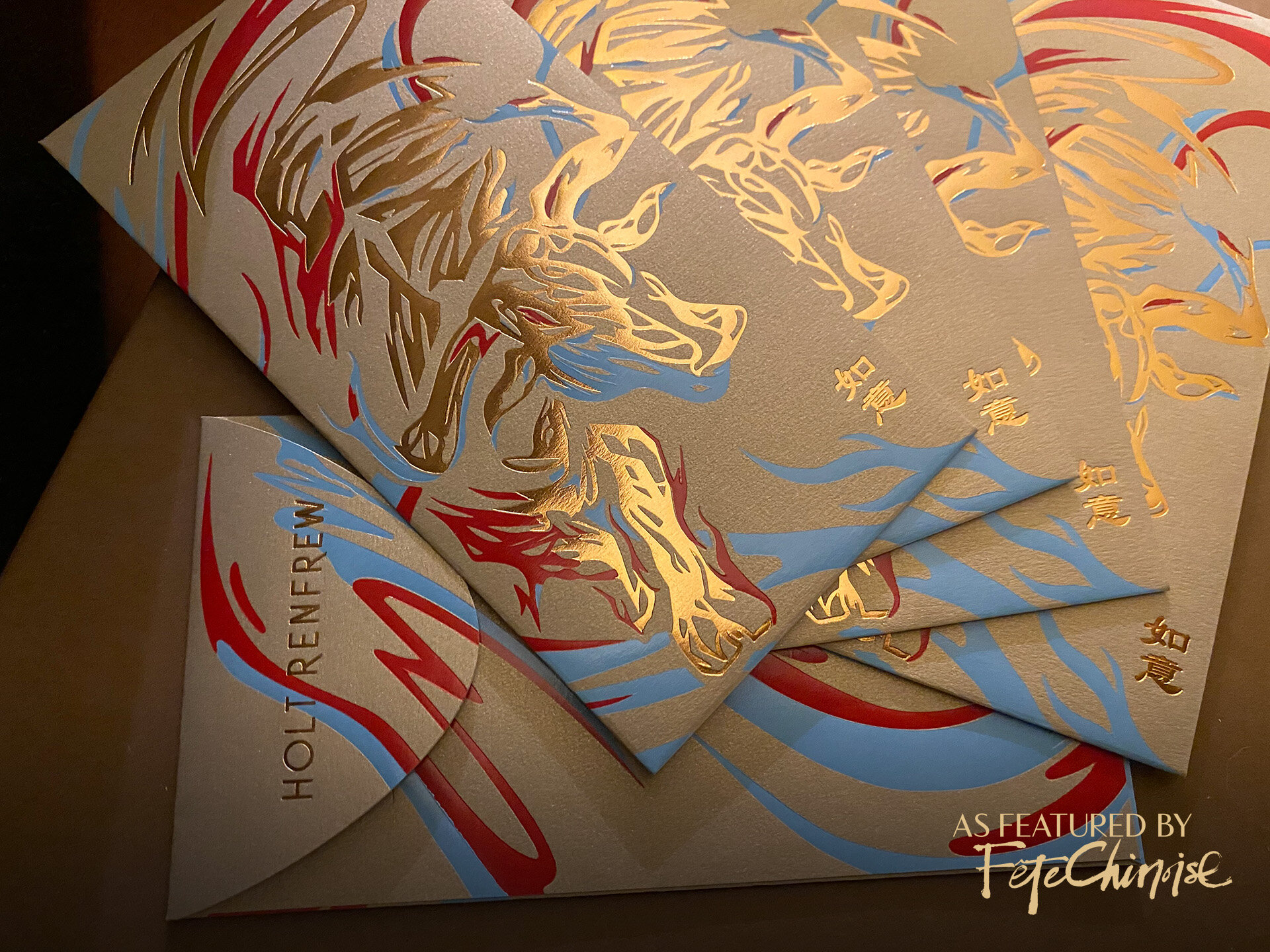
HOLT RENFREW’S VIBRANT 2021 DESIGN OF LUCKY POCKETS IN GOLD, RED AND BLUE. PHOTO: DEBORAH LAU-YU.
What are your thoughts on the designs we discussed? Do you have a favourite? We’d love to hear from you and if you have images to share, please send us a note! We hope you have an incredible Lunar New Year — all the best to you as the rest of the Year of the Ox unfolds.